Guides · Graphic Design & Layout
Corporate Design for Small Businesses: Presenting a Consistent Image
A consistent appearance builds recognition and trust – even on a small budget. These elements are essential for corporate design in small businesses.
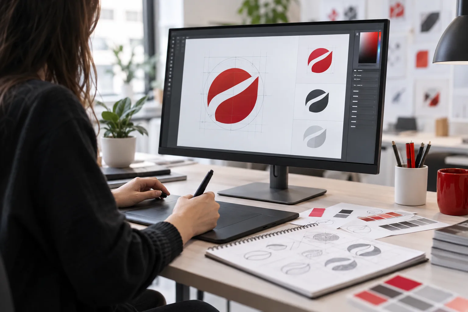
 AI-generated image
In short: Corporate design defines how your business appears visually: logo, colors, fonts, imagery, and design guidelines. Even a compact set of rules just a few pages long is enough for small businesses to look consistent and professional across website, business cards, vehicles, and workwear.
- Consistency builds recognition and trust.
- Core elements: logo, colors, fonts, image style, layout rules.
- A short style guide is enough to get started.
- Applies equally to print, web, textiles, and signage.
What does corporate design include?
| Element | What is defined? |
|---|---|
| Logo | Variants, minimum size, clear space, incorrect usage |
| Colors | Main and accent colors with CMYK, RGB, Hex, and possibly spot color values |
| Fonts | Fonts for headings and body text, substitute fonts for office use |
| Imagery | Style of photos and illustrations |
| Layout | Grid, spacing, design of letterhead, ads, social media |
Why is it worthwhile for small businesses?
Customers encounter your business in many places: website, Google profile, quotes, invoices, company vehicles, workwear. When everything looks consistent, your business is more memorable and appears reliable. At the same time, you save time because you don’t have to decide anew each time how something should look.
Overview of applications
- Business materials: business cards, letterhead, quote and invoice templates, email signature
- Online: website, social media profiles, newsletters
- Promotional materials: flyers, brochures, posters, trade show booths
- Textiles and signage: workwear, vehicles, signs
How to create your corporate design in 5 steps
- Clarify values and target audience: How should your business be perceived?
- Create or update your logo (professional logo design).
- Define colors and fonts – focusing on readability and contrast.
- Design core applications: business card, letterhead, website look.
- Compile everything into a short style guide.
Common mistakes
- Too many colors and fonts – this looks chaotic.
- Multiple homemade logo versions in circulation.
- Colors chosen on screen but look very different in print.
- No responsible person ensuring consistency.
What belongs in a compact style guide
For small businesses, a few pages are enough for everyone involved – from the printer to the web designer – to understand:
- Logo variants with minimum size and clear space
- Color chart with CMYK, RGB, and Hex values
- Fonts for headings and body text, including office substitute fonts
- Examples of image style and selection
- Templates for business card, letterhead, email signature, and social media post
Store the style guide together with all logo files in a central location so everyone can find the current version.
Conclusion
Corporate design is not a matter of company size. With a few clear rules, you present yourself professionally everywhere. MYPOINT develops your visual identity and implements it in print, web, textiles, and signage – everything from a single source.