Guides · Graphic Design & Layout
Professional Logo Design: Process, File Formats & Tips
A great logo is simple, memorable, and works everywhere—from favicons to vehicle graphics. Here’s how the design process works and which files you should receive.
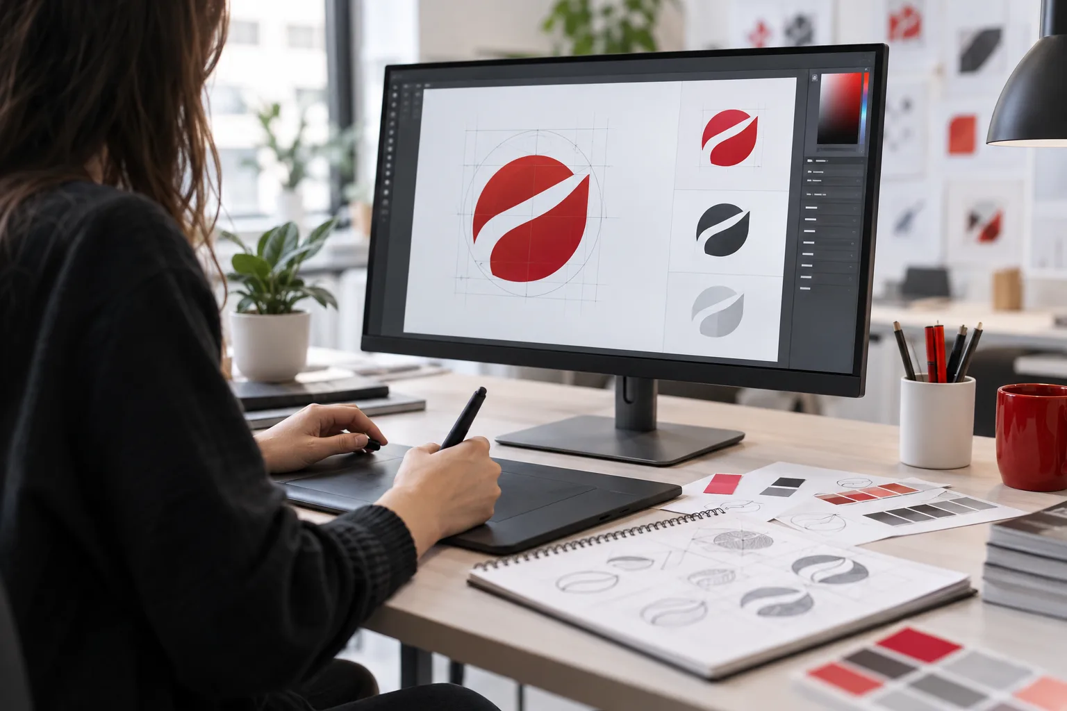 AI-generated image
Professional logo design – in short: A professional logo is created in four steps: briefing, initial drafts, refinement, and delivery of all file formats. Good logos are simple, work in color and black & white, and come as vector files (SVG, PDF, or EPS) to ensure sharpness on business cards, websites, apparel, and vehicles alike.
- Simplicity beats complexity.
- The logo must work small (favicon) and large (vehicle graphics).
- Vector files are essential for print and signage.
- Usage rights should be agreed upon in writing.
How does professional logo design work?
- Briefing: Who are you, who is your target audience, and what impression should your company convey? Are there colors or symbols you prefer or want to avoid?
- Research and drafts: Reviewing competitors helps avoid confusion. Then, several design directions are created.
- Refinement: The preferred draft is optimized: typography, spacing, colors, and variations.
- Delivery: You receive all files for print, web, and signage – ideally with a brief usage guide.
What makes a good logo?
- Simple: Few elements are easier to remember.
- Scalable: It remains recognizable even at 16 × 16 pixels.
- Color-independent: It works in a single color, for example on stamps, vinyl, or embroidery.
- Timeless: Short-lived trends look outdated after a few years.
- Distinctive: It sets you apart from competitors.
Which file formats do I need?
| Format | Type | Use |
|---|---|---|
| SVG | Vector | Website, infinitely scalable |
| PDF / EPS | Vector | Print shops, signage, vinyl cutting, embroidery |
| PNG (transparent) | Raster | Office documents, social media |
| JPG | Raster | Only where transparency is not needed |
You should also receive color values: CMYK for print, RGB or Hex for screens, and possibly spot colors (e.g., Pantone) for textiles and signage. For details on preparing print files correctly, see Preparing Print Files Correctly.
Logo variations for every use
- Main logo (horizontal) and a compact version (square)
- Positive version (dark on light) and negative version (light on dark)
- Single-color version for stamps, vinyl, and embroidery
- Icon alone as favicon and app symbol
Don’t forget usage rights
Make sure in writing that you have unlimited rights to use the logo in time and space – including advertising, vehicles, and textiles. Check before use whether similar trademarks exist and consider registering your own trademark.
Common logo design mistakes
- Too many details: Fine lines and small fonts disappear on business cards, embroidery, or favicons.
- Only raster files available: A logo only as JPG cannot be scaled cleanly or used for cutting.
- Trend fonts: What’s trendy today looks outdated in a few years.
- Color gradients without alternatives: Gradients are difficult to reproduce in vinyl cutting, embroidery, and screen printing – a single-color version is mandatory.
- Similarity to competitors: Risk of confusion weakens impact and can cause legal issues.
Conclusion
A good logo is the foundation of your entire brand presence – from corporate design to vehicle graphics. MYPOINT creates logos that work everywhere and delivers all file formats. More about graphic design & printing.